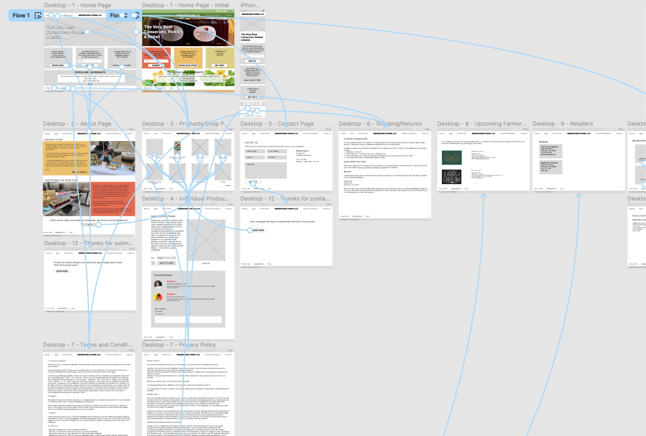
A new jam, pickle and relish business recently asked me to design and develop a website to showcase and sell their products online. Previously, I had done wireframes with paper and pencil but decided to give Figma a try. At first, the really simple interface didn’t make much since but after watching a quick tutorial on YouTube, I was ready to jump in on the wireframing.
Figma will allow the most basic wireframing in black and white all the way to full color and images for a website design in a complete state ready to code. It will even allow active buttons and links as well as drop downs. Walking through the site navigation by clicking on buttons, menus and links in Figma is completely possible.
When it was time to review the design with my client, sharing the link to the design in the cloud on Figma was a breeze. Initially, I presented the Figma wireframe via a video call with screen sharing, but it was easy to provide the link directly to the file in the cloud so the client could continue to review on their own.
This design only scratched the surface with Figma and I’ll definitely use it for future website design and development work.